
Phone app
x
Meet integration

Integrate Google DUO (now Google Meet) into the native phone app

Project Background
Intro
The main objective of the project was to integrate Google DUO into the Samsung phone app, with the aim of providing users with a user-friendly and reliable way to make video calls to their family and friends, as well as offer work-related communication capabilities. Additionally, this collaboration aligned with Samsung's business roadmap to expand partnerships with Google and other third-party companies.
However, launching this feature required alignment with Verizon due to the Samsung-Verizon collaboration expectation.
Internal Stakeholders
-
Content & Service, Sr. Manager
-
Technical PM
-
R&D, Sr. professional
-
HQ UX designers
Verizon Stakeholders
-
Device & Product Marketing Manager
-
Project Manager
-
Executive Experience designer
My Role
As the UX designer based in the NJ office, besides working with headquarters designers to develop the final solution. I also serve as the PoC for Verizon, where I regularly met with Verizon stakeholders to ensure alignment and incorporated their feedback during design iterations.
With Verizon's approval, we successfully launched the feature on time and implemented this feature when the devices first launched. This feature has been applied on all Samsung devices to date.
The Problem
Why do we need this integration?
Only providing carrier video calls on the phone app can create limitations for users regarding communication, cross-platform compatibility, functionality, costs, and dependence on carrier infrastructure.
After the pandemic, there has been a massive demand for video communication, an increase of 503%. (source: Medium.com)
Why Google DUO?
DUO has the highest quality satisfaction compared to other video call apps (Zoom, WhatsApp, etc) on 1:1 & group calls
.png)
The Benefit
For Samsung
-
Become more attractive to users who want an easy-to-use communication tool
-
Compete better with other competitors by offering integrated video-calling capabilities
-
Increase customer loyalty and retention, as users may be less likely to switch to a different smartphone company with better communication tools
For Verizon
-
Lead to a strategic partnership with Google, which can provide access to additional resources
-
Can promote usage of the app and potentially increase revenue by driving up data usage
For Users
-
Can connect with iOS/PC users directly from the phone app, without needing a separate app
-
Reach out to others internationally, making it easier to stay in touch with friends and family abroad
-
Enjoy a reliable and secure communication tool that offers high-quality audio and video calls
The 'Chooser UX'
The 1st proposal from Headquarter Call team
In this proposal, the headquarters call team was providing one consistent Chooser UX across all related apps and entrances including Dialer, Call history, Contact, and Message.

Dialer's pad

Contact DP

Recents
The Issues
When I first got the design, I noticed that the design was not fulfilling the user's needs for the following reasons.
-
There is an extra step to make video calls every time.
-
It is not flexible for users to set up for each contact.
When I delivered the solution to the Verizon team due to time constrain, it was rejected for the same reasons. Therefore, I need to propose a new design to resolve the concerns.
How to reduce the extra step?
Long press to change the default value
If the default value can be changed on the dialer's page, then the users don't have to select every time they want to call a particular person.
The proposal is to tap the button to make video calls, and long press the button to change the selection.
And the selection will be saved for this individual.
.png)
However, long press to bring up a menu and to make a change is a patent US20170359302A1, which was identified by our patent team.
The other concern with this approach is that it is confusing whether this selection is per contact or for the entire app.

Competitor Analysis
To gain more inspiration, I also looked into how competitors are solving those issues. For iOS, the phone app has a 'Favorite' tab. Users can set it up and call using the preferred method with one tap.
However, unfortunately, our native Contacts app is having a different structure, It is not possible to adapt a similar flow.
But this analysis has opened up the possibility of the Contact app, which leads to the final solution.

iOS Favorites behavior
Samsung Contact
Switch per contact
Since ‘long press to make change’ can have patent issues, and ‘select on dialer can be confused about if the change is for an individual,’ the Contact app becomes a better location to make change. By doing so, the patent issue can be avoided.
According to the usability test, it is clear that the user is making change for this individual contact. However, it is hard for users to find this popup.

Long press button
How to increase discoverbility?
Brainstorm ideas
We are very optimistic about the approach with the contact app, but I also need to resolve the problem of not being able to see the popup. Therefore I have brainstormed some conditions below:
Proposal A
Provide a one-time tooltip when a user sees Chooser for the first time in the dialer or on the contact detailed page.

1st time on dialer
One-time tooltip shows up automatically
Proposal B
Provide a tooltip when user closes Chooser, or comes back to the dialers page.

Open Chooser
Close Chooser
Show tooltip
Proposal C
Provide a help icon to educate the user about the new setting.

Dialer
Contact
Popup
Make selection
Proposal D
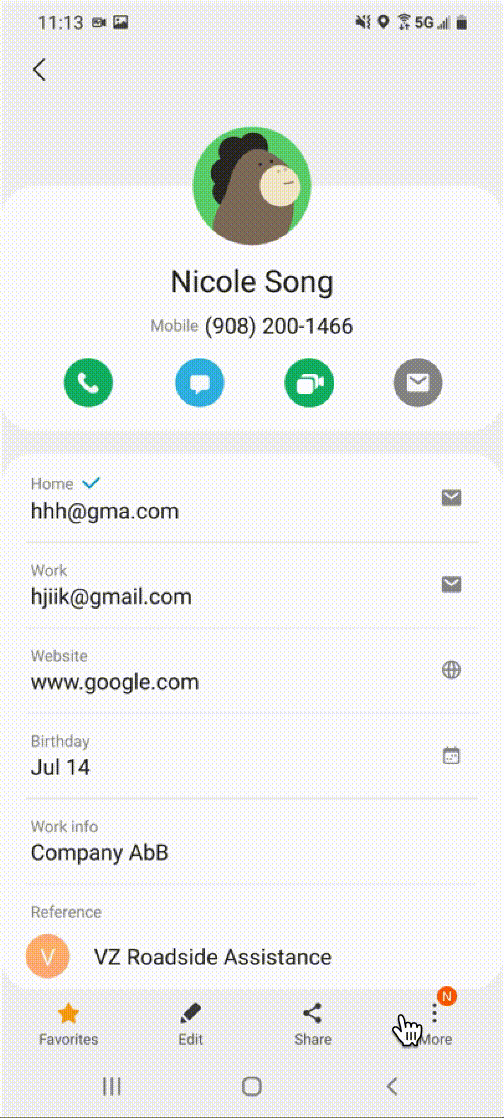
Show N badge to indicate a new change in the menu item. The N badge is a commonly used UI indicator in Samsung design system.

Contact
More menu
Proposal Comparison
Each proposal is having different advantage and dis-advantage. I compared all of them based on 'visibility of the tooltip' and 'relevance with user intention.'
Visilibilty of the tooltip

Relevance with user intention
Proposal D can be supplement for A,B,C
Final Solution
Final Proposal
After consolidating ideas from cross-functional teams, the final solution is:
E: One-time tooltip when Chooser is opened for the 2nd time on the dialer
This UX is most relevant to user intent, and users have a high chance of using it on the spot.
This proposal also includes showing the N badge to indicate the new menu.

To-Be Dialer's Pad
To-Be Contact page
Visilibilty of the tooltip
.png)
Relevance with user intention

Outcome & Items to improve
Outcome
-
Successfully approved by Verizon
-
Rolled out late 2021 for phase 1, early 2022 for phase 2
-
Implemented on all devices until now
Items to improve
During this project, I encountered a surprising failure: the patent issue. But I was glad it was identified internally before shipping it to the market.
Before this project, I didn't realize how important UX designers need to take that into consideration, and we need to find an alternative route. And more importantly, this can extend its way to other companies or industries, and I will always keep it mind for future projects.